I meet new authors all the time who are writing or have written a children’s book. And who are promoting their books and seeking distribution. Word of advice, please remember all children are not at the same reading level and some may have real difficulty reading the text. Knowing this ahead of time and taking into consideration that some children may have a learning disability will add to the success of your book. So often I turn down book suggestions for my collections because they are not designed well and lack good illustration. Fancy fonts I came across this article by author, Amy Witcher Richau and she explains the importance of book design in reference to dyslexic readers. It’s definitely worth reading if you are writing a children’s book.
4 Ways a Book Design Can Frustrate a Dyslexic Reader By Amy Witcher Richau
As an avid and early reader it pains me that my daughter doesn’t enjoy reading like I do. But even after years of interventions that is still her reality. And there are few things more frustrating than feeling like you have finally found a book that will speak to your child only to have her put it back on the shelf because of the size of the text or the design of the pages.
Reading books on an e-reader like a Kindle where you can change the look and the size of the font can be a huge win for struggling readers. Some fonts are thought to be more “dyslexic friendly” than others— but not all books have digital versions.
I don’t believe any book designers or publishers are making their books less accessible to dyslexic or struggling readers on purpose, but I do think some books would find more readers (or frustrate their readers a bit less) with a few design changes.
All of these examples below boil down to one main idea — make the text as easy to read as possible.
1) Text Not Over a White Background
Something that pops up from time to time in books for young readers is text over a busy design.
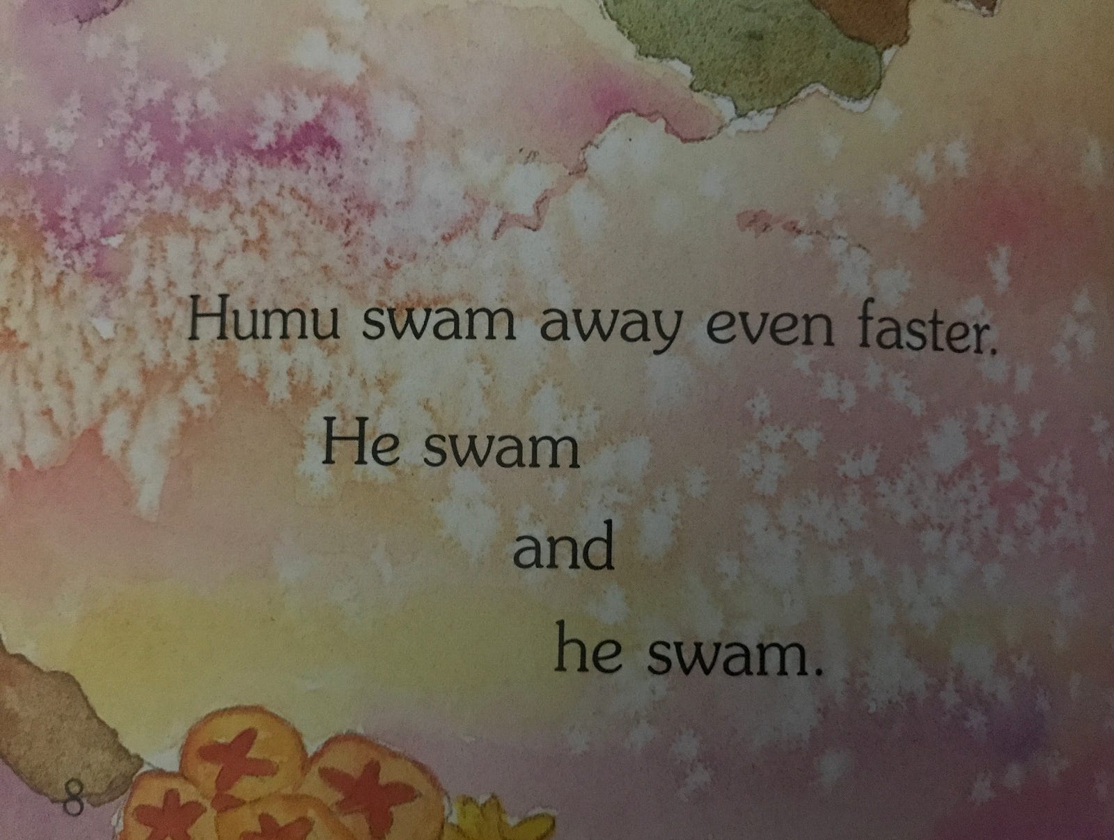

The changes in the background (colors, shapes) can prove to be surprisingly problematic for some readers. Especially if the child is having a hard time tracking their reading. I’ve seen some books with black text over a very dark background that reminded me of seeing subtitled films where the titles disappear depending on what the background of the scene is.
Keeping the text over a plain white background (or even a black background with white text) keeps things simple and easy to read.
2) Text Over Patterns
Sometimes books use a patterned design under all of most of the text in a book.
Look at the words on the right side of the image above and then at the words on the left side. I’ve heard from several adults who don’t have any reading difficulties that struggle to read text behind patterned backgrounds without getting a headache or experiencing eye strain.
3) Fancy Fonts
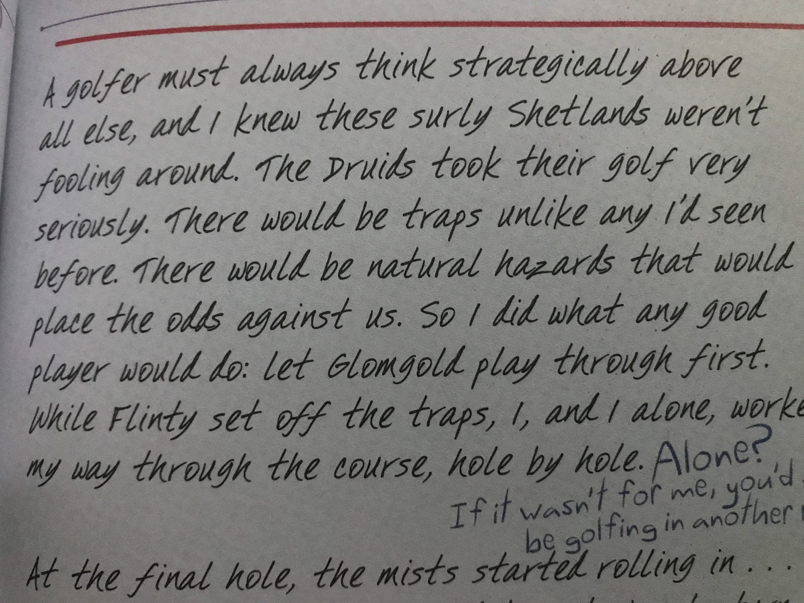
Fancy fonts can make a book more appealing to look at. But will it make it harder to read for the target audience? The screenshot above is from a book that my daughter immediately wanted to buy when she saw the cover, but when she got it home and saw the text inside she almost as quickly set it aside.
Fancier fonts, especially cursive type fonts, can throw off some readers. Sadly cursive isn’t even taught in many elementary schools anymore, but I still see cursive or cursive-like fonts in many books written for kids.
4) Lots Of Small Text On The Page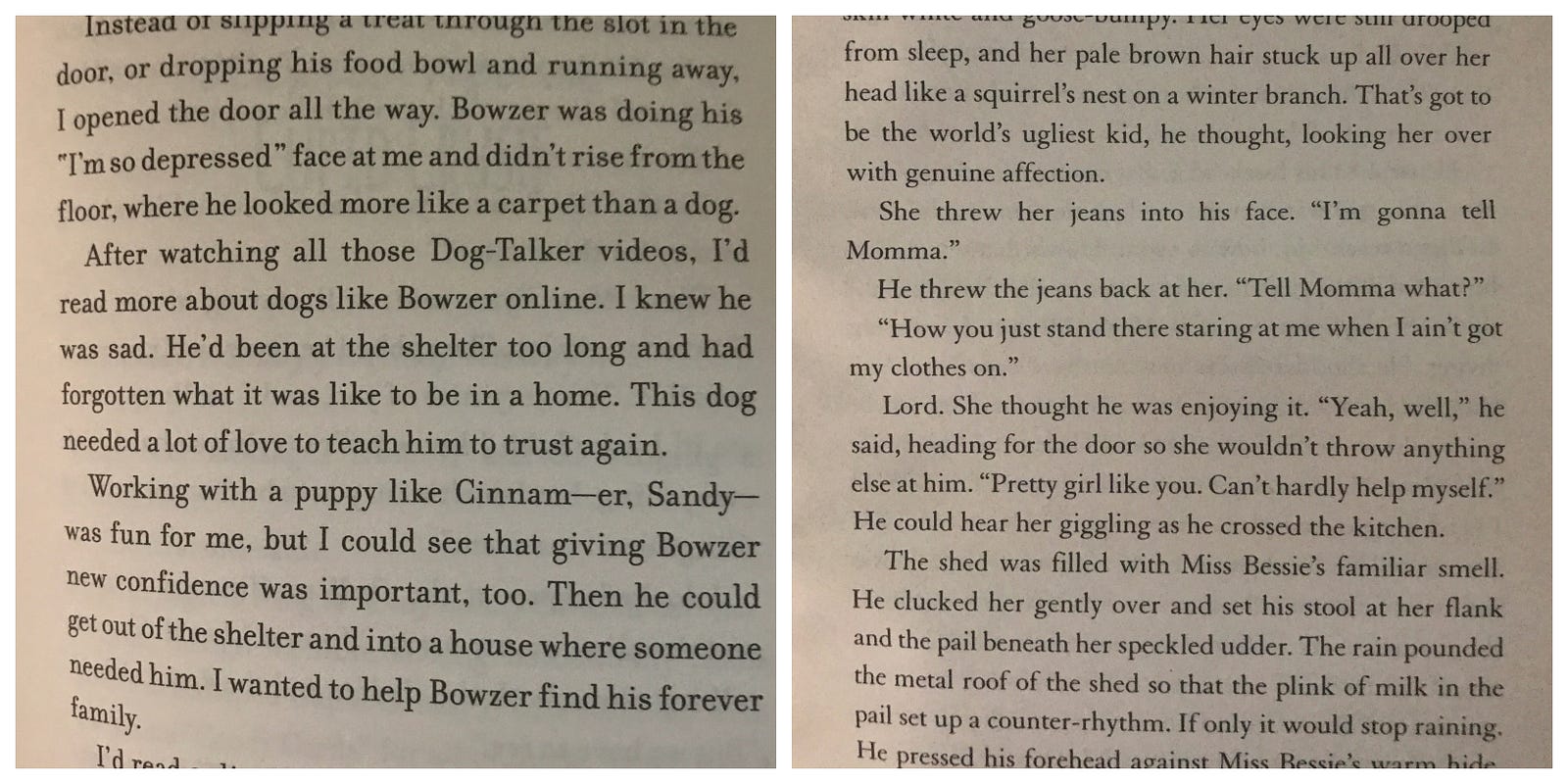
Before my daughter decides to buy a book she does one thing. She flips through the pages to see how small the text is, how tight the spacing is, and overall checks out how many words are on the page.
If she sees what she believes to be a “text wall” — back goes the book. It’s just not for her anymore. There isn’t a huge difference between the font size in the above image on the left and on the right but it’s noticeable to a struggling reader. If you choose larger fonts and keep the spacing of lines of text a fair distance apart you are inviting a larger number of readers to your book.
Are some of these examples nitpicky? Sure. Few of these examples would ruin a book for a child or adult who had an interest in reading it. In fact, many of the books in the images above are favorites in our household. But if you have the power to make a book easier to read I hope you choose to do so by keeping the text in your book simple and easy to read.


